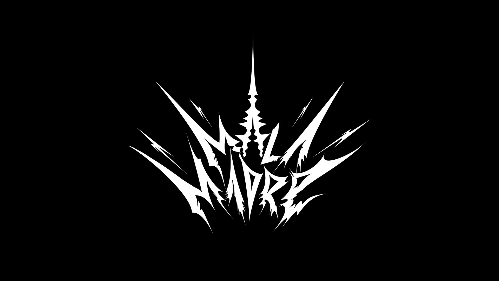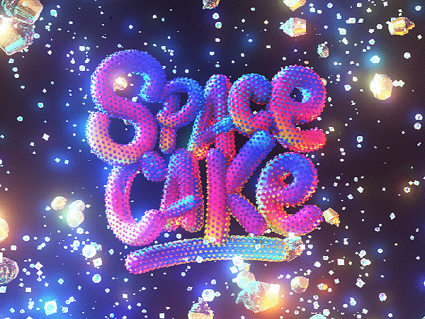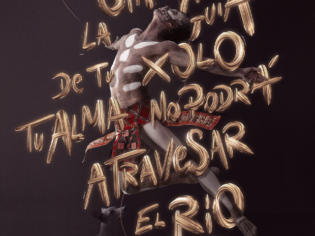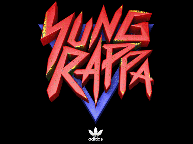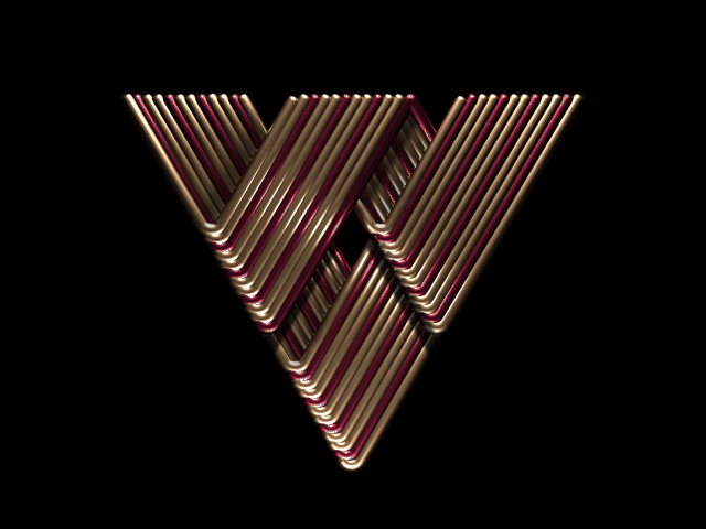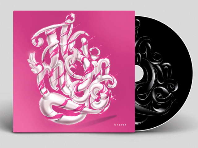

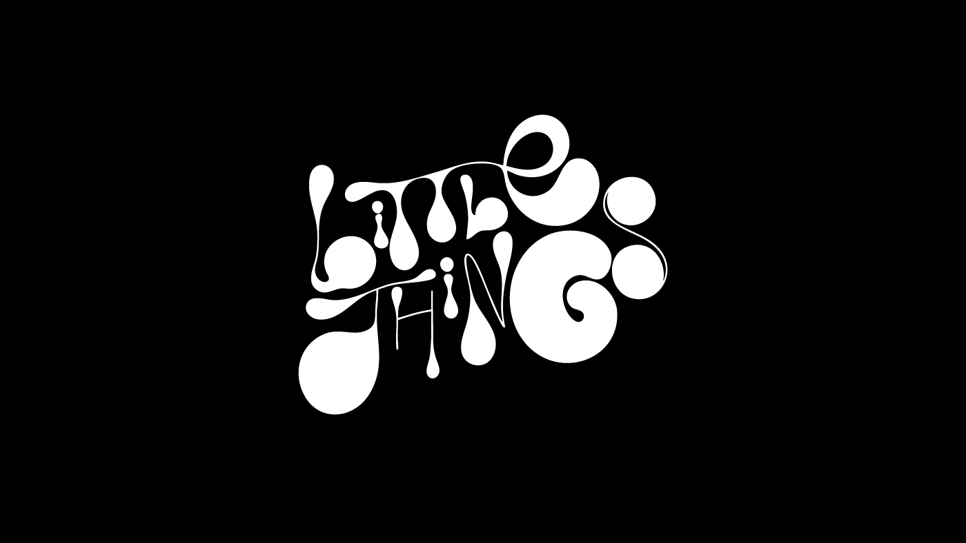
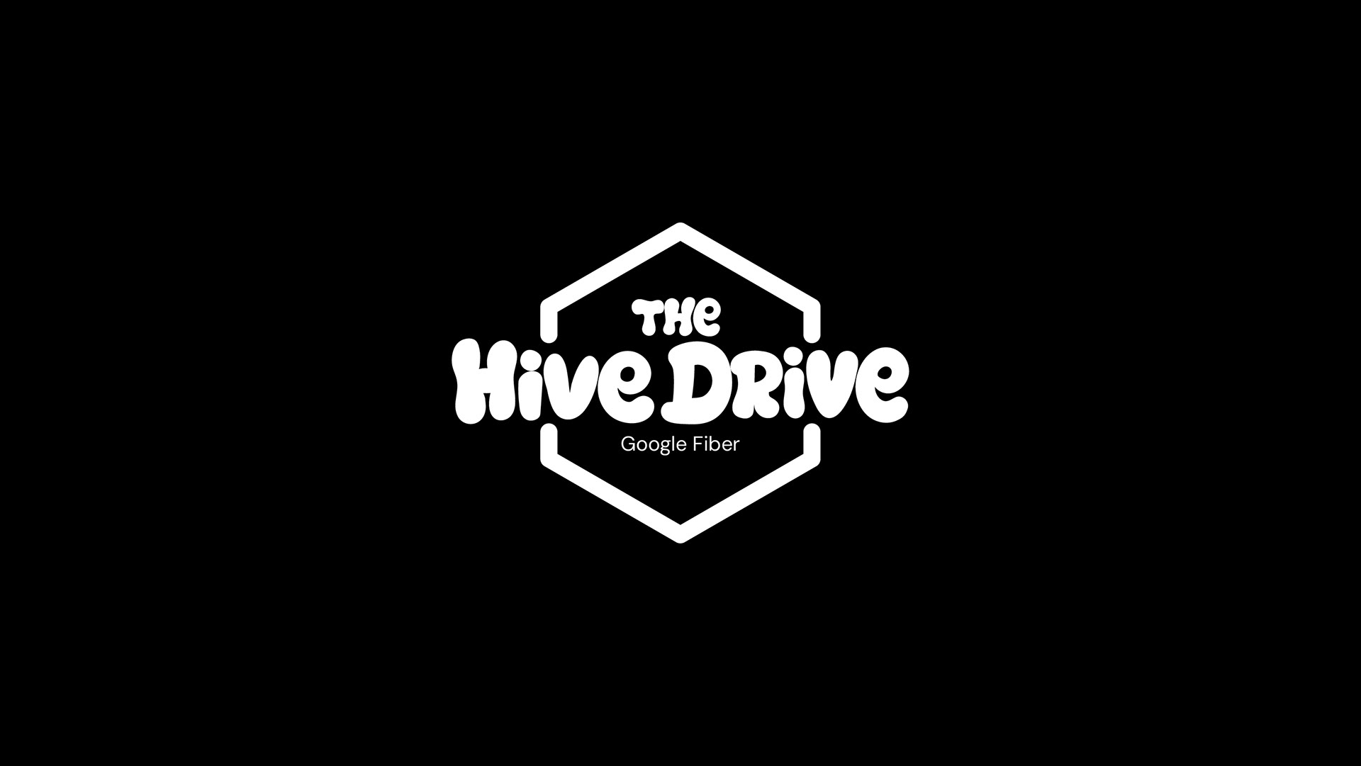
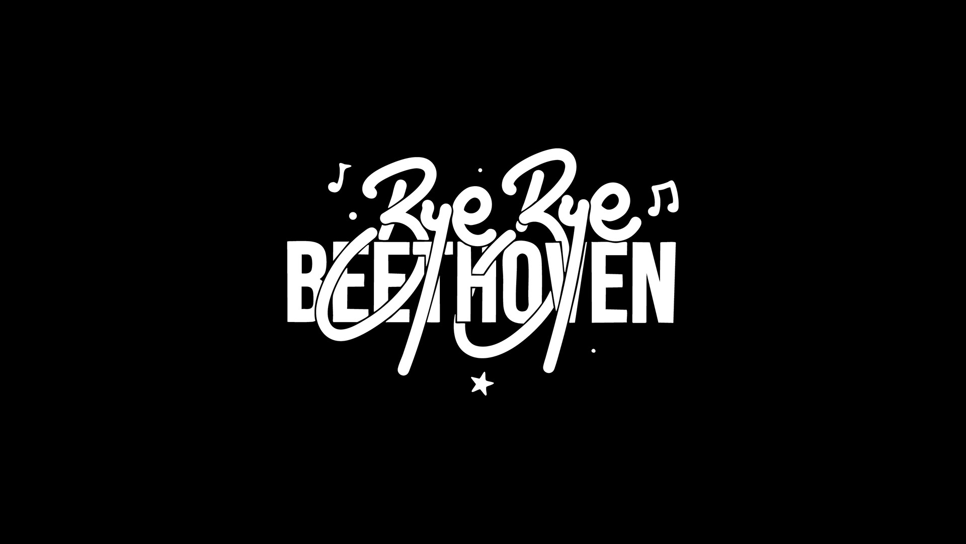
Here’s a compilation of some logos and titles, crafted from shapes, lettering, and typography (and above all, with dedication and love) that I’ve created throughout my career.
Some are recent, and some are older but still “gold” to me. Some were used and published, while others weren’t. Some were created for top brands, others for smaller ones, and a few pieces had to be left out due to NDA restrictions.
Some are recent, and some are older but still “gold” to me. Some were used and published, while others weren’t. Some were created for top brands, others for smaller ones, and a few pieces had to be left out due to NDA restrictions.
I wanted to present them this way, clean and without any embellishment, just the shapes, to emphasize that what truly matters is the composition. That’s what ultimately defines whether a form works or not. If the composition isn’t solid, no amount of color, shading, or 3D effects can make it better.
A few of these pieces were used as flat shapes, while others evolved into 3D designs or were refined in Adobe Illustrator to apply color, lighting effects, or other enhancements. I believe most of these shapes carry the personality and nuance required for high-level design work.
And they are all 100% handcrafted by a human.
Do you want a logo or project title that stands out at first glance, or do you want your project to blend in with the crowd?
Batch 1
↓


Batch 2
↓


Batch 3
↓


Batch 4
↓


Batch 5
↓


Batch 6
↓