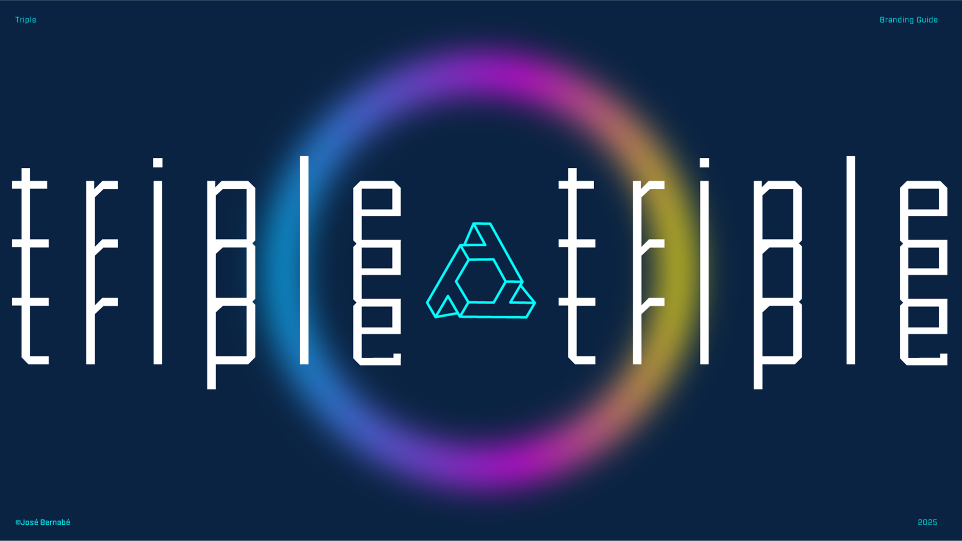

TRIPLE
Built with purpose. Assembled for impact.
Triple is a tech brand driven by innovation and intentional design. Their mission is to create cutting-edge devices where function, efficiency, and aesthetics come together in perfect harmony. Every product is crafted to solve real-world problems while maintaining a sleek and purposeful design language.
The logo - three interlocking T’s- visually and conceptually reflects the brand’s core values: precision, strength, and smart assembly. It’s more than a symbol, it’s a structural metaphor for how the brand builds its solutions. Just like the logo, every detail is considered, every component connected.
For this project, the goal was to develop a visual identity that embodies this mindset. The result is a bold, modular, and scalable system that communicates trust, innovation, and obsessive attention to detail. The symbol is built on strict geometry and balanced proportions, reinforcing Triple’s belief that how something is made matters just as much as what it does.
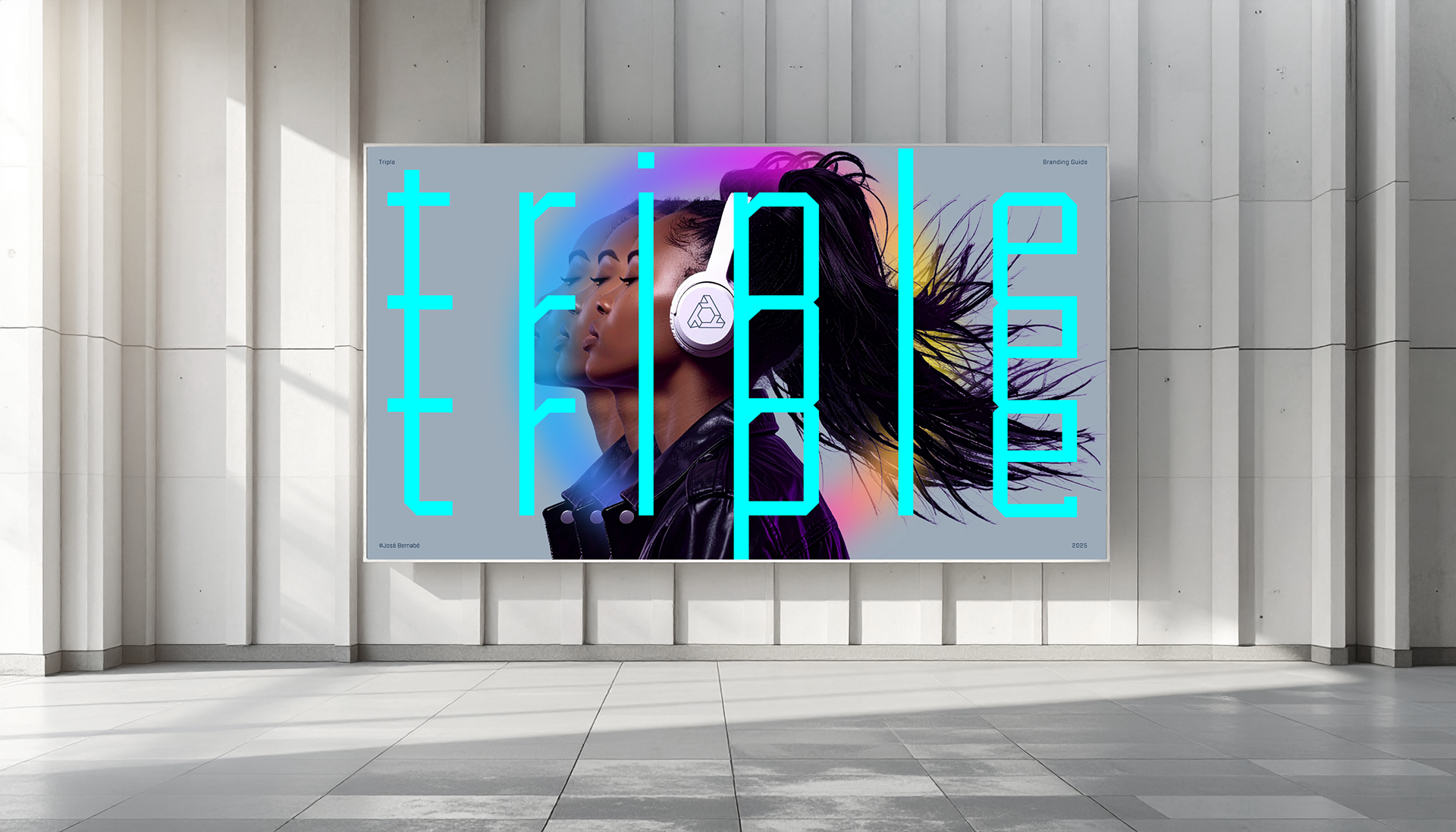
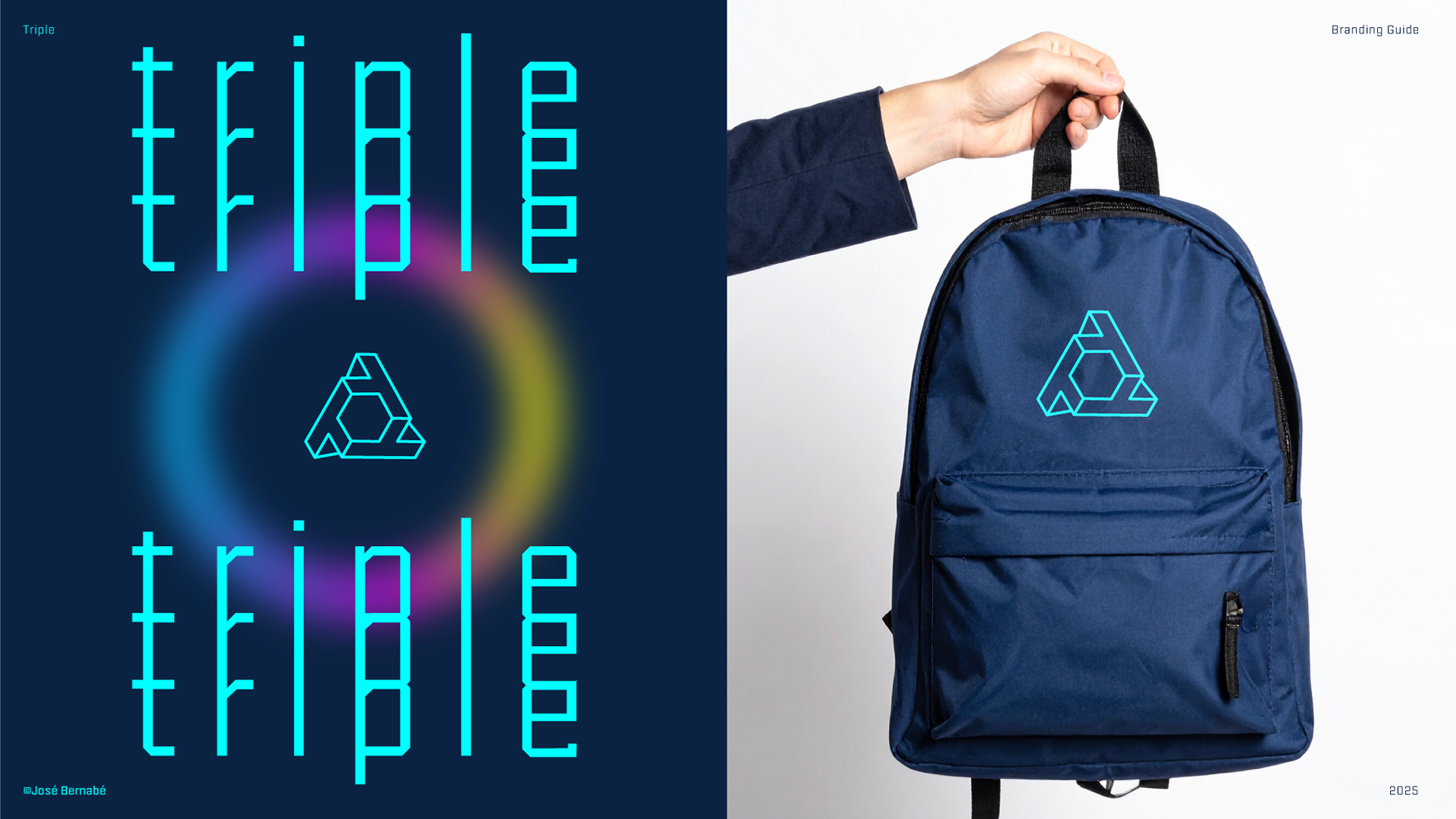
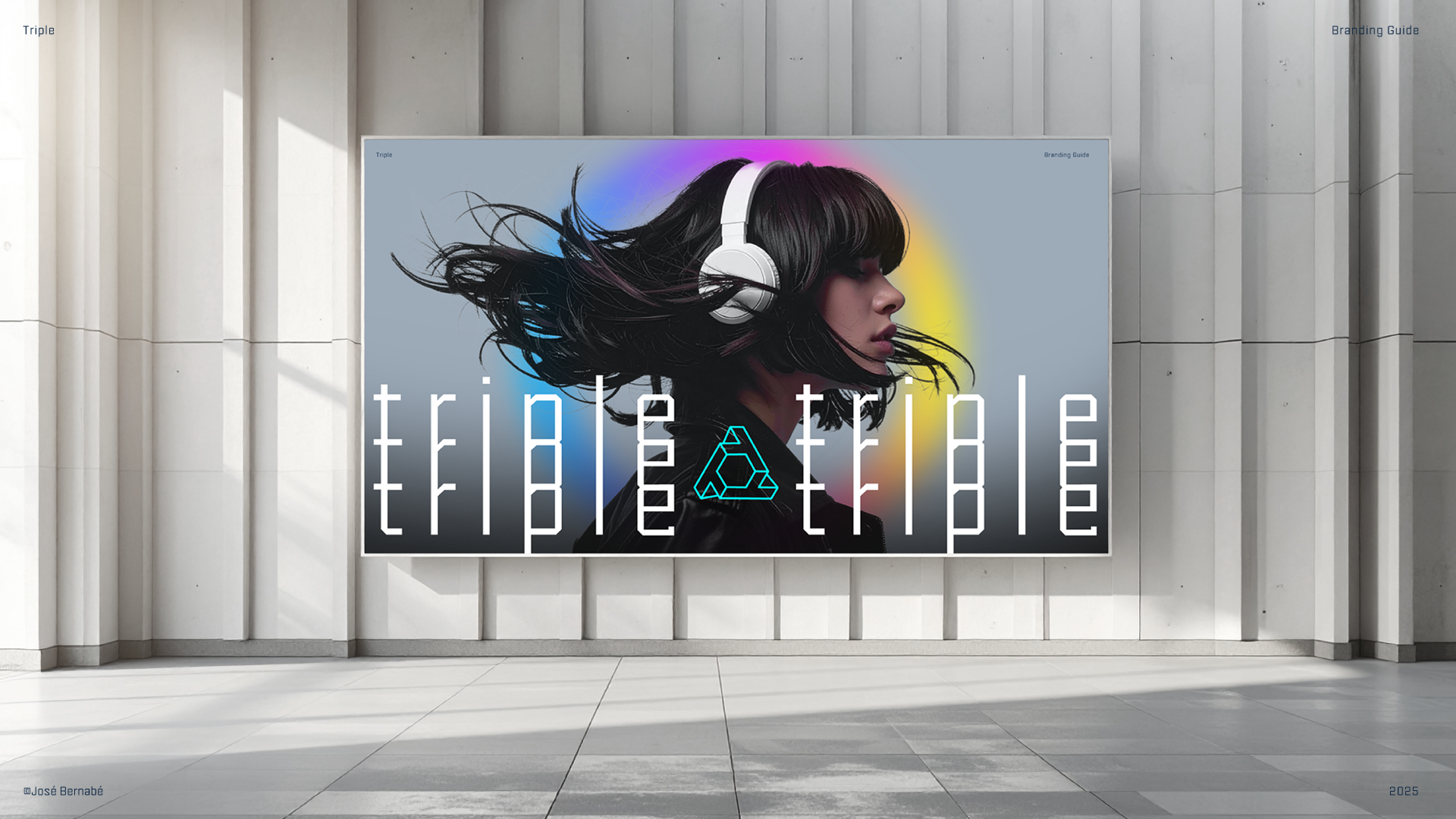
Here’s the result of the creative process. I hope you like it.
Here’s the result of the creative process. I hope you like it.